The input here was deliberately bad, because that's what expense data looks like when it comes back from six people's inboxes.
Three sample lines, no header row, and the fields don't even sit in the same order twice: `AWS 2026-06-12 412.55 infra` puts the category last, while `lunch client 2026-06-13 88.20` doesn't have one at all and leads with two words that could be a merchant, a description, or both. Nobody said which column was which. That had to be worked out from the shape of the values — this one looks like a date, that one like money, the trailing word like a bucket name — and then held consistent across forty invented rows that had to look like they came from the same messy source.
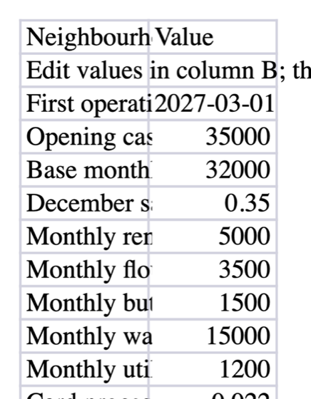
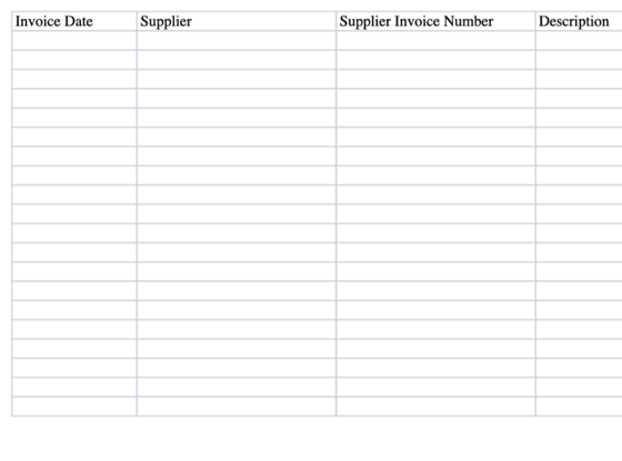
What came back is a proper workbook. An Expenses sheet with real columns, and a separate Summary sheet carrying the category breakdown and the monthly total, rather than three subtotal rows wedged into the bottom of the data.
Ninety seconds, $0.260554 on Smart: https://elsedoes.com/share/7f805eace6e94e1cbc0bfe29f88f201d